Cards
Cards are surfaces that display content and actions on a single topic. They should be easy to scan for relevant and actionable information. Elements, like text and images, should be placed on them in a way that clearly indicates hierarchy.
Text Only Cards
Text Only Card is one that contains a title, a descriptive text. To use the Card Component,
add .card-title and .card-text
inside a <div> with class .card-text-only
Lorem Ipsum is simply dummy text of the printing and typesetting industry. Lorem Ipsum has been the industry's standard dummy text ever since the 1500s, when an unknown printer took a galley of type and scrambled it to make a type specimen book.
Card With Badges & Shadow
Use the .card-badge class along with .card to create Cards with a badge.
You can also add the .card-title, .card-header, .card-img, .card-text,
.card-buttons, .card-button and .card-icon classes to add more details to your card.
To make a Card with a Shadow, use the .card-with-shadow class on your card.
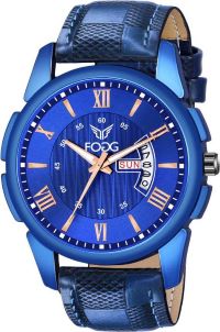
Lorem ipsum, dolor sit amet consectetur adipisicing elit. Distinctio enim optio
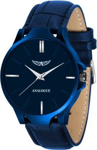
Lorem ipsum, dolor sit amet consectetur adipisicing elit. Distinctio enim optio
Cards with Dismiss & Text Overlay
You can create cards with a Text overlay using the .card-text-overlay class. The dismiss feature can be achieved by adding the class .btn-close. You can refer the code snippet below.


Lorem ipsum, dolor sit amet consectetur adipisicing elit. Distinctio enim optio
Vertical and Horizontal Cards
You can create Vertical cards using the original .card class and also create Horizontal cards using the .card-horizontal class. You can refer the code snippet below.


Lorem ipsum, dolor sit amet consectetur adipisicing elit. Distinctio enim optio


Lorem ipsum, dolor sit amet consectetur adipisicing elit. Distinctio enim optio